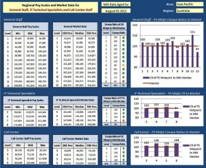
If you create reports on a regular basis, and of course many of you do, be prepared to be absolutely amazed by what you can do after attennding this great course. The secret sauce to creating incredible reports is something called Dashboards.
So, what is an Excel Dashboard?
An Excel Dashboard provides insight, analysis and alerts. They’re fully interactive and dynamic and can help with project management, customer service, data management, financial forecasting and much more.
Key Dashboard Features:
- Usually fits on one page
- Displays key trends, comparisons and data graphically or in small tables
- Provides the reader with conclusions to their objective
- Is often interactive allowing the user to filter data and switch views themselves
- Employs best practices that enable the report to be updated quickly and easily (often at the click of just one button)
Who should attend: Anyone who create reports and want to improve their data presentations. Dasboards are very well suited to reports using dynamic or live data as well as data being drawn from different sources.
Prerequisite: Participants who are comfortable with intermediate to advanced features of excel including charts, graphs and pivot tables.
What you will learn:
MOVING FROM SPREADSHEETS TO DASHBOARDS
- What are Dashboards and Reports?
- Define the data dimensions and filters
- Dashboard Design Principles
- Use layout and placement to draw focus
- Format numbers effectively
- Use titles and labels effectively
DEVELOPING YOUR DATA MODEL
- Building a Data Model
- Data Model Best Practices
- Excel Functions for Your Data Model
- The VLOOKUP function
- The HLOOKUP function
- The SUMPRODUCT function
- The CHOOSE function
- The OFFSET function
- The MATCH function
- The INDEX function
- Working with Excel Tables
EXCEL CHARTS
- Creating a chart
- Switching the row and column orientation
- Changing the chart type
- Adding and deleting chart elements
- Formatting chart elements
- Understanding Chart Types
- Creating Combination Charts
- Creating and Using Chart Templates
- Charting a Noncontiguous Range
EXCEL CHARTS … CONTINUED
- Converting a chart to a picture
- Using graphics for series formatting
- Linking title text to a cell
- Working with Chart Axes
- Working with Gridlines
- Working with Data Labels
USING PIVOT TABLES & PIVOT CHARTS
- Creating a basic pivot table
- Customizing Your Pivot Table
- Formatting numbers
- Changing summary calculations
- Suppressing subtotals
- Hiding and showing data items
- Sorting your pivot table
- Producing pivot table views
CHARTLESS VISUALIZATION TECHNIQUES
- Dynamic Labels
- Linking Formulas to Text Boxes
- Excel’s Camera Tool
- Formula-Driven Labels
- In-cell charting
- Using symbols
CREATING INTERACTIVE DASHBOARD COMPONENTS
- Adding a scroll bar to a data window
- Adding option buttons to a chart
- Using a spin button to sort data
- Using a combo box drop-down menu
- Using a list box control
- Using the Check Box Control
AUTOMATING DASHBOARDS AND REPORTS
- Recording macros
- Assigning a macro to a button
- Building navigation buttons
- Dynamically rearranging pivot table data
SECURING YOUR DASHBOARDS AND REPORTS
- Securing access to the entire workbook
- Limiting access to specific ranges
- Protecting the workbook structure
- Linking Excel Dashboards to PowerPoint
- Distributing Your Dashboards Via PDF


